
The Navigational Dashboard: a New Method to Diagnose Why Your Funnel is Breaking
The data you need already exists. You just need to look at it differently.

Introduction
Data is not the new oil. Oil follows a linear process: find it, extract it, refine it, sell it. Data is closer to gold. You have to sift through a lot of mud before finding a small nugget that is actually valuable.
That is what analytics often feels like.
You spend your days looking at dashboards, analyzing heatmaps, and watching session recordings. And yet, you still cannot answer basic questions:
Why are users dropping off here?
What exactly is causing friction?
What should we change on this page?
At some point, you start doubting yourself. Maybe I am not good enough to find insights. Maybe this job is not right for me.
But you are not the problem. Data is not the problem. The issue is how that data is represented.
Every visualization is a simplification of reality. In the process, critical aspects of behavior are removed. As a result, you are left trying to understand user behavior through incomplete views.
What's wrong with the modern analytics stack
Most dashboards look like this:
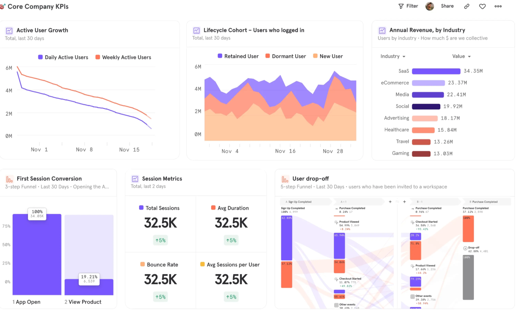
At first glance, they appear clear and well structured, but they rarely tell teams what to do next.
This is because traditional dashboards aggregate data. They compress user behavior into static metrics, removing sequence and context and hiding how those numbers were generated.
Path exploration appears to solve this problem by introducing sequence.
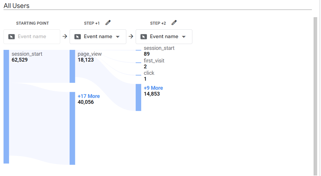
However, even if you can see that 18,000 users went from Page A to Page B, you have no idea what led them there. Did they click a primary button, a secondary link, or use the navigation menu? Did they compare options, ignore key elements, or take unintended paths? Path analysis does not capture any of this. It reduces behavior to page-to-page transitions.
Heatmaps reintroduce interface context by showing where users click.
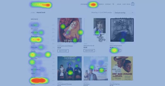
However, they capture behavior at a single point in time, without showing what happens before or after. You can see where users interact, but not where they came from or where they go next.
In addition, heatmaps struggle with dynamic interfaces like pop-ups, dropdown menus, and content that appears after interaction. This creates blind spots in areas where users make key choices, such as form completion or navigation.
Session recording solves the problems of sequence, context, and outcome. You can see exactly how users behave, what they click, where they hesitate, where they leave. However, this comes at the cost of aggregation.
To understand patterns, you often need to manually watch hundreds of sessions to identify a single problem. Even with AI, you are relying on summaries instead of directly observing patterns at scale.
In addition, session recordings are time-consuming and biased. What you choose to watch shapes what you find. Systematic issues can be missed if they do not appear in the sessions you review.
So, each tool shows only part of behavior. You never have the full picture.
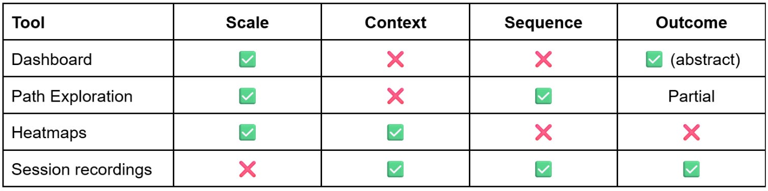
This leads to A/B tests that don't move the needle, vanity metrics used to justify results to management, and finger pointing between teams.
The Navigational Dashboard
A navigational dashboard is different. Instead of showing user behavior in abstract charts, it maps the data directly onto the interface. Each interaction is anchored to a specific element and quantified, making it clear what users focus on and how they engage.
You do not just see that users dropped off, you see where they were, what they clicked, what happened next, and whether that action helped them move forward or created friction. That representation is much closer to how people actually experience a website or product.
How to read a navigational dashboard
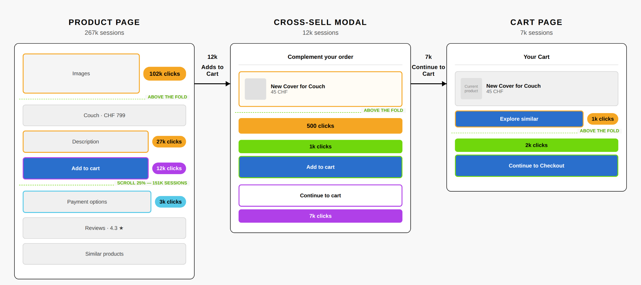
Let’s analyse an actual navigational dashboard. The example below uses a typical e-commerce funnel modeled on IKEA's structure, with illustrative numbers.
Product page
Assessment
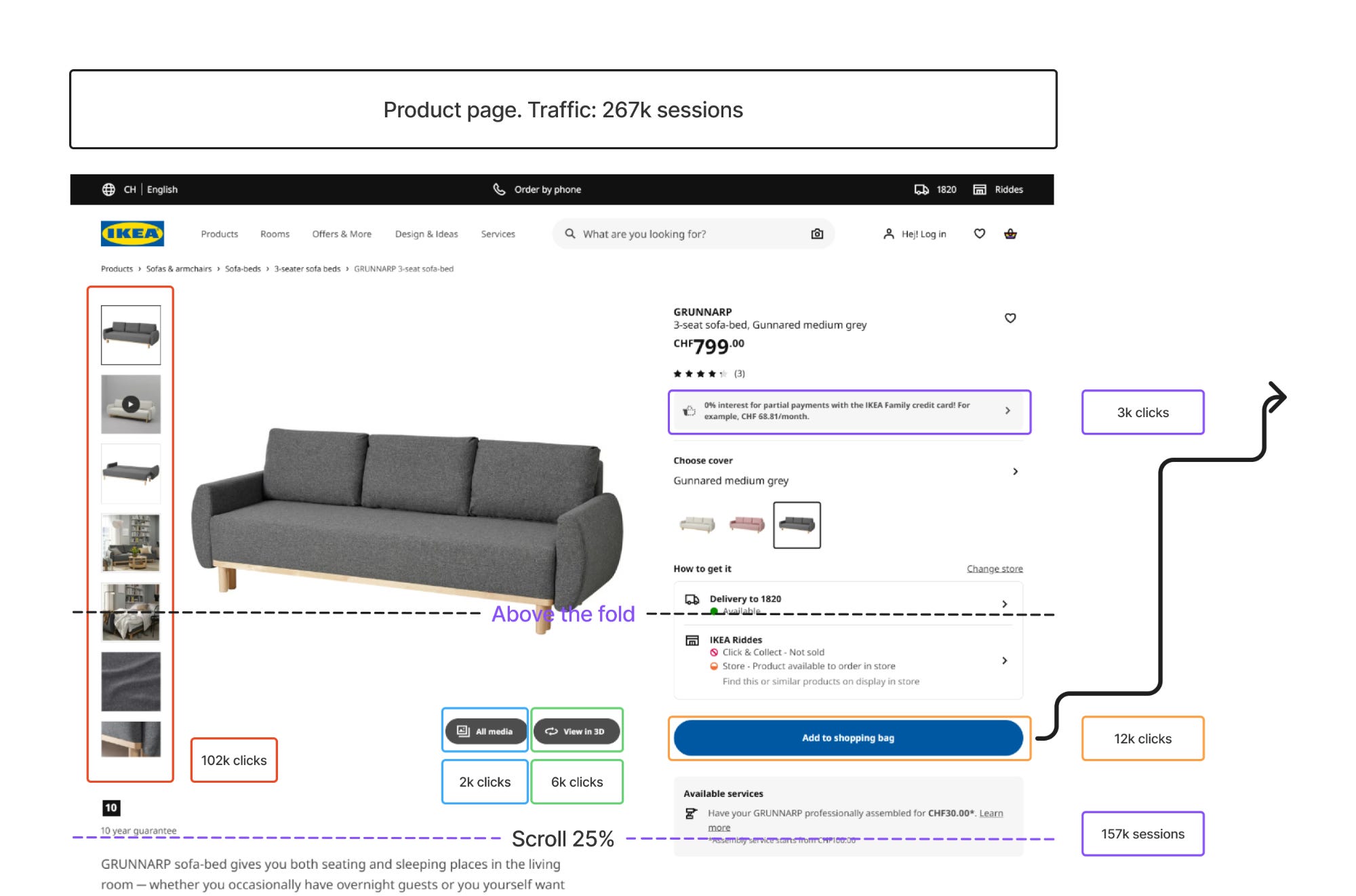
On the product page, the first thing that stands out is image exploration. 102,000 users click on the product images, which is 38% of everyone who visits. That’s a strong signal of interest.
But only 12,000 of those users click Add to Cart, just 4.5%. So we have a real gap between exploration and commitment. Users are engaged with the product, they’re looking at it, but something is stopping them from committing.
Looking further down the page, there’s a sharp drop in engagement between 25% and 50% scroll. A large portion of visitors never make it past the fold. The ones who do tend to be the more decision-oriented users. The product description gets 27,000 clicks (10% of visitors), which suggests these are people actively trying to make up their mind before buying.
Recommendations
The page is generating interest but not closing it. Key decision-making information like delivery details, return policies, and essential product attributes should be more visible above the fold, where the bulk of users actually look. The space below the fold is reaching a smaller audience than the current design assumes.
Cross-sell modal
Assessment
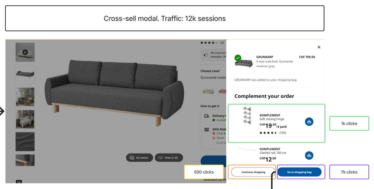
Now let’s see what happens after Add to Cart. Of the 12,000 users who add the product, only 7,000 (58%) make it to the cart page. That’s a 42% drop at the exact moment users have signaled intent to buy. Something is interrupting them between intent and action.
Looking at what they encounter next, the answer becomes clear. At that moment, users are presented with a cross-sell modal, which captures 1,000 interactions. So this drop-off isn’t random. It’s directly linked to a diversion of attention that happens immediately after Add to Cart.
The timing is the problem. The interruption occurs at the exact moment users are ready to proceed, which disrupts their flow and pulls a significant portion of them out of the funnel.
Recommendations
The cross-sell should either be delayed until after users have entered the checkout flow, or reduced in prominence so it doesn't compete with the primary action of progressing to the cart. Right now, it's working too well at the wrong moment.
Cart page
Assessment
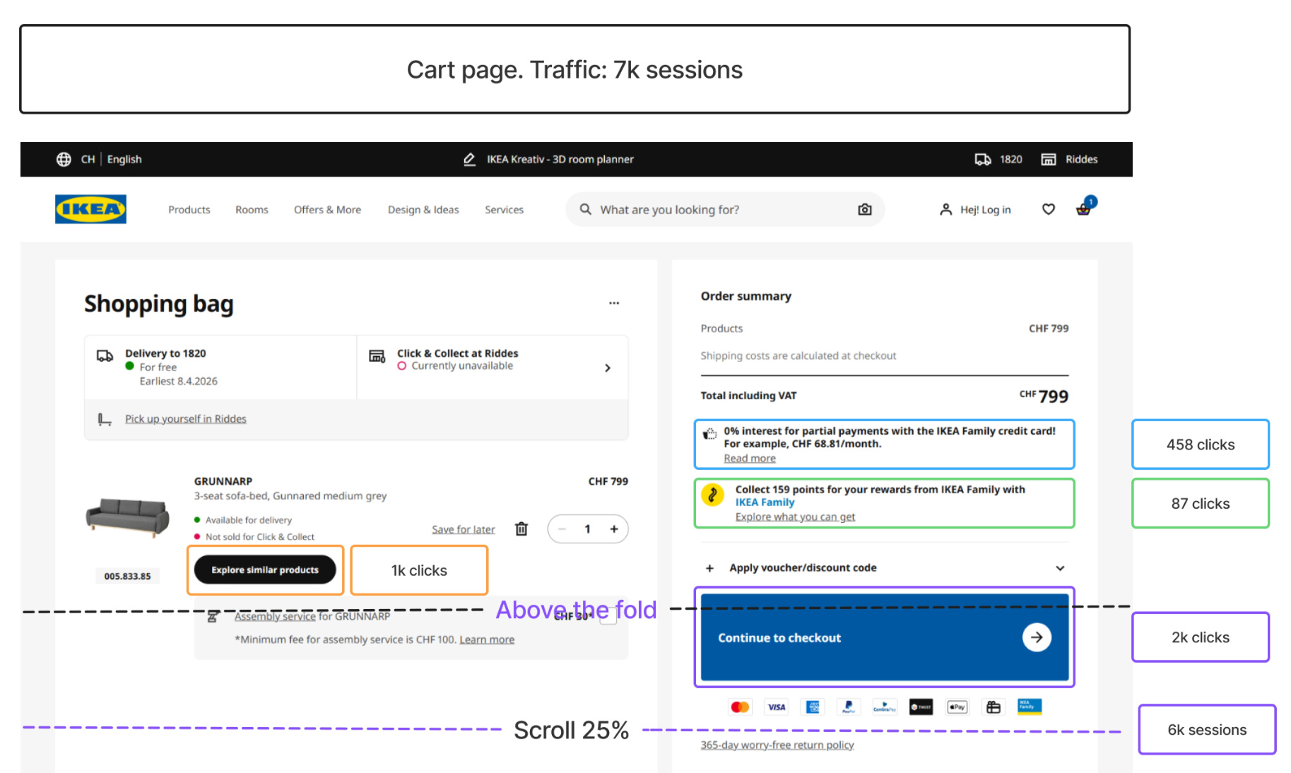
Final screen. Of the 7,000 users who reach the cart, only 2,000 proceed to checkout. That’s another major drop-off, this time at the final step before conversion.
But where is the attention going? Looking at the rest of the page, 1,000 users click to explore additional products instead of continuing. So a meaningful share of users, at the moment of checkout, are choosing to keep shopping rather than complete their purchase.
Scroll behavior is minimal across the page. Very few users reach the lower sections. This tells us that whatever content and recommendations are placed further down are having limited impact on user decisions. Most of what matters is happening above the fold.
Recommendations
The cart page is competing with itself. The checkout action should be visually dominant and clearly positioned as the next step. Secondary elements like product recommendations should be deprioritized or moved further down the page, where minimal scroll already tells us they have limited influence on what users actually do.
None of these findings would be visible in a single tool. A dashboard or path exploration would have shown us the drop-off numbers, but not why users were leaving. A heatmap would have shown the clicks on Add to Cart, but not the modal that interrupted them next. Session recordings would have shown the modal, but only after hours of watching individual users, and even then with no way to know how common the pattern was.
A different way of reading data
These three findings did not require new tracking. The clicks were already being captured. The drop-offs were already measured. The scroll depth was already recorded. What changed is how that data was represented.
A navigational dashboard does not replace your existing analytics tools. It changes what you can see in the data you already have. The friction points that were invisible in dashboards and disconnected in heatmaps become observable the moment behavior is mapped to the interface itself.
Building a navigational dashboard that produces useful findings requires choices at every stage: which journey to pick, which screens to include, which interactions to track, which findings are worth surfacing, which recommendations are realistic for your context. Those choices come from experience. I have spent the past eight years working across digital marketing, product, and analytics, examining funnels in different industries and at different stages. The value I bring is not just the technique, but the experience of applying it to many different funnels and knowing what to look for.
Working together
A typical project takes two to three weeks and produces a navigational dashboard for one user journey, along with a prioritized list of friction points and test hypotheses your team can action. The work runs in four phases.
Phase 1: Scoping and diagnosis. We pick one specific journey with a clear drop-off and agree on what success looks like. You walk away with a one-page scope document and a defined success metric.
Phase 2: Data and reconstruction. We audit the tracking that exists and identify what’s missing. Any critical gaps are fixed first, so the dashboard is built on clean data. You walk away with a tracking gap report and a clean dataset of the journey’s behavior.
Phase 3: Navigational dashboard. We build the dashboard on the screens that matter, typically three to four, mapping clicks, scroll depth, drop-offs, and outcomes onto the interface itself. You walk away with the navigational dashboard, delivered as a shareable artifact.
Phase 4: Insights and next steps. We identify the top friction points and translate each one into a concrete hypothesis your team can test or implement. You walk away with a prioritized list of three to five test hypotheses.
If you have a funnel with a drop-off you cannot explain, get in touch at arben.kqiku@gmail.com.